top of page
Project Overview
Duration
2 Weeks (14 Days)
Role
Solo UX Researcher
& UI Designer
Method
User Research & Synthesis
Persona creation
Information Architecture
Sketching & Wireframing
Usability Testing
Tools
Figma
Google suite
Optimal workshop
Background & Objectives
Background & Objectives

The problem with iHerb
iHerb has a stellar track record for delivering a wide variety of affordable health and wellness products straight to customers’ doorsteps at speed and scale. However, the website’s design seems stuck in the mid 2000’s and it’s navigation, overwhelming.
Task
To redesign the online shopping experience on iHerb with a focus on streamlining the interface and making important action items more salient.
Design Approach
Discover
User Research
Affinity Mapping
Define
User Personas
Site Mapping
Usability Testing
Design
Information Architecture
Sketching
Wireframing
Usability Testing
Deliver
Interactive Prototype
Design Iterations
Discover & Define
Discover & Define
Step 1: User Research + User Persona
To get a sense of what are the appeals and drawbacks of the iHerb experience, I talked to five iHerb users - who made a purchase from the website in the past 3 months.
Three things I’ve learnt from the User Interviews:
A GO-TO FOR AFFORDABLE VITAMINS AND SUPPLEMENTS
Low price and constantly on promotion are the key reasons why users gravitate to iHerb. They laude over bang-for-their-buck bundle deals and find them much cheaper over the brick and mortar competition - even for the same brands.
SCIENTIFICALLY DRIVEN, SEEKING PROOF OF EFFICACY
Almost all users have done some form of research into the products they intend to purchase from the site, and they rely heavily on the digital word of mouth from other users through reviews and ratings.
CONVENIENCE AND FUSS-FREE IS THE MAIN PRIORITY
The speed of delivery and ease of purchasing supplements from the site are some of the main draws of iHerb. However many alluded to the cluttered nature of the website hindering them from an even more fluid experience.
User Persona
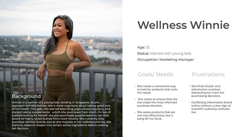
These insights then informed the creation of the persona ‘Wellness Winnie’ - a young mom who just dove into the world of wellness through yoga and supplements. She desires credibility, convenience and a sense of trusted efficacy when purchasing her supplements online.
Any elements that cause confusion or distraction annoys her.
Step 2: Usability Testing + Redefining the Information architecture
I conducted a Usability Test on the existing iHerb website with 3 participants who have heard of iherb but never purchased or purchased items more than 3 months ago. The rationale: to get unbiased familiarity with the website.
The test requires participants to go through 4 task flows to test the experience of the entire buying process.
a) Overall site navigation
b) Research on specific ingredients
Shortlist product between 3 or more choices
Changing product variation during checkout
Fuss-free checkout
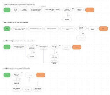
After conducting the test, I also came up with the user flow for each task - allowing me to identify major pain points that prevented or annoyed users from completing the task efficiently.
User Flow Diagram
Synthesising the research done, I’ve identified key problems to solve for each stage of the buying process.

Browsing Experience
-
Main navigation bar is too loaded
-
Improve visibility
-
"Sort by" filter too inconspicuous
-
Out of stock products not obvious
-

Purchase Decision
-
Product description is unhelpful
-
Improve visibility of ‘resource page'
-
No easy way to compare products

Check-out Experience
-
Affording final amendments
-
Being able to edit cart before checking out
-
A better way of visualising free shipping qualification criteria
-
-
Option to checkout quickly without needing to sign up
Design
Design
Browsing Experience: Declutter & Simplify
Simplified & Intuitive Navigation Menu


Laying out the site map helped reveal the layers users would have to navigate to when interacting with the site.
This gave rise to the decision to simplify the top navigation bar to show what users would use the most.
Through an open card sorting exercise, I managed to validate the existing categories that iHerb uses - with a few name changes inspired by participants of the exercise.
To increase the ease of discoverability of categories, I’ve separated the categories out and given them their own space in the top navigation for easy reference - resulting in a flatter hierarchy in site navigation. In addition, I’ve added a quick product finder in the middle of the home page, allowing for a more intuitive product search experience.
Improved Website Visibility
Design tweaks were also made for filters and “out of stock” products to make them more conspicuous to the users.
-
“Sort by” filter was made larger, and more conspicuous to afford users browsing products by price, popularity, no. of reviews etc.
-
Products that are out of stock are also made more overt, with washed out images and prominent signalling.

Purchase Decision: A helpful consultant

Product descriptions: Tell me the most important thing!
-
Secondary information given a lower weightage, and shifted to the bottom right
-
Key product information such as main functions, and suggested dosage is moved up top.
Improved visibility of resources
-
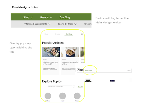
The main navigation bar now includes a “our blog” tab, bringing iHerb’s wealth of articles and resources front and centre for users to explore.
-
Clicking the tab launches an overlay upon clicking - showing popular articles, categories of interest the user can double click into and the ability to search articles with any keyword or topic in mind.
-
Links to relevant resources are included in product pages while users search for specific ingredients/ categories.

Compare products easily
With the addition of a dedicated compare button, users can now easily compare multiple products’ key information such as ratings, price, and ingredients before making the final purchase decision.
Checkout Experience: Forgiving and Fuss-Free
Affording error recovery
-
A top banner featuring “only $xx away from free shipping” allows users to know if their purchase meets the free shipping criteria with ease.
-
Adding a dropdown to easily change between product variations also aid in users’ error recovery.

Quick check out - with unnecessary hurdles
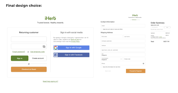
Added an option to checkout as a guest - in the same color as the CTA check out button from the previous screen for continuity.
This brings them to the form to fill in their contact information and mailing address - with the option of saving their information for the next checkout
Validating Design: Usability Testing
To test if the design worked - I conducted a second Usability testing with 5 more participants.
The redesigned iHerb website saw an increase in Single Ease Question rating across all key task flows, thus validating that I was moving towards the right direction.
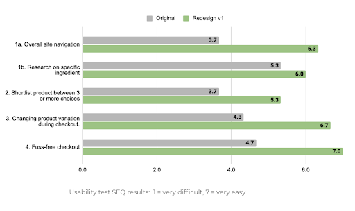
However users gave further insight on how the current design could be further iterated.
-
Certain navigation names are not immediately intuitive - open to guesswork.
-
Health condition categories under “help with” can be further grouped together.
-
The home page is still busy and distracting to users who casually browse.
-
Compare button is inconspicuous.
Deliver
Deliver
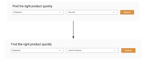
Due to the time constraints that I had for this project, I could only implement a couple of tweaks to the final design.
Renamed ambiguous “Help with” which can be open to interpretation to a specific action oriented signal - “I want to improve”
Quick check out - with unnecessary hurdles
Quick check out - with unnecessary hurdles
Recategorised the list of health of conditions
Using a closed card sort exercise with over 20 participants, I’ve recategorised a long list of health conditions into intuitive groupings in a dropdown list, collapsible in an accordion.

Next Steps
ADDRESS MORE DELTAS/ NEGATIVES FROM UT2
-
Streamline the homepage & rename subjective group titles e.g. “Trending now”, “Best sellers” etc.
-
Implement CTA action to blog posts in a manner that does not trigger the mental model of a banner ad
-
Make the “compare” button more conspicuous
EDIT THE PROTOTYPE & VALIDATE WITH A 3RD UT
-
After implementing the above feature edits, I will edit the prototype and do a third round of Usability Tests to fine tune any further shortfalls in the user flows.
FINAL PROTOTYPE & SCHEDULE FOLLOW UP MEETING WITH STAKEHOLDERS
Next Steps
Thoughts and Reflections
Documenting design thinking
Overall, I could have done much better job in the ideation process through brainstorming through sketches and lo-fi wire framing before hopping on to designing mid-fi concepts.
This would allow for a clearer representation on how I decided to go with certain design choices based on the research.
Usability Tests could be done earlier in the design process
Adding on to the previous point, I feel that testing a lower fidelity prototype would have given me more insight to the functional problems of the redesign - instead with the mid-fi prototype, I had to weed through user comments such as "why are all the prices the same" or "I don't understand the product titles".
Bolder, Fresher designs
This is rather subjective, but I felt that I did not push the creative boundaries for this redesign - as I approached it with a "don't fix what isn't broken" mindset and only addressed what users mentioned in the first Usability Test.
However, in the second iteration of this project (if time allows) I would definitely update the design of this prototype, and do further UTs to iterate.
bottom of page
